Showing posts with label Development. Show all posts

Monday, 18 November 2013

CDDA - Character texture reference/underlay

Today I referenced some images to use in my character beauty shot. These would be used under the colour of my choice to enhance it and make it more 3D, less flat. I got brown leather for the apron, gold for the boots, I got wool for the shirt but in the wrong colour so I will either change this in Photoshop or find more pictures, human skin though I would probably darken this slightly and black wool/black leather for the trousers. 


Sunday, 17 November 2013

CDDA - Character side view

Today I have made more progress with my character turnaround board by completing the side view. It took me longer than the front view for a few reasons. I'm not so comfortable with human anatomy from this angle as it isn't generally an angle you would draw a character at apart from for technical sketches so I had to research into the human body and warp it to fit my Dwarf. Also I found the arm and hand hard to get right. Being to scale with my other picture, the arm has to be at the same angle which just so happens to make it seem very foreshortened which was awkward but doable in the end. Also hands are just hard. 


Wednesday, 13 November 2013

CDDA Colour Schemes

Today I worked on some colour schemes for my character using colour charts and different kinds of colour schemes. First I researched a few different colour schemes but the ones I decided to try and use were analogous colours and complementary colours. My first style was analogous colours using orange to yellow. I started here because I have always envisioned the apron as being a shade of brown and figured I should start there. I like the apron, boots and trousers but the shirt is horrible and I feel the trousers and apron are a little too similar colours. 

Next I tried another set of complementary colours, green and purple. I chose these because I thought purple could work well for the shirt or trousers and green could be a possible choice for the apron. Sadly they came out badly and won't be considered. The boots I tried a gradient effect on the scales which I thought was interesting and considers further thought. 

I then tried a pair of analogous colours with the apron and shirt matching up, red and orange (brown), and the trousers and boots, blue-green and blue. This was more effective than any of my previous designs despite not being great colours. I liked the mix of colours, thinking that it makes the image more interesting to the eye. I also quite liked the red of the apron though think that it should be on a different part of clothing.


Next I tried a pair of complementary colours. The shirt and boots, purple and yellow, and apron and boots, orange (brown) and blue - green. This was interesting and the colours seemed to fit quite well.


This colour scheme was a mistake. It features complementary colours between the boots and both the apron and the trousers and then analogous colours between the boots and the apron. This happened by accident when I got a little confused with the colour wheel and I don't like the result at all.


On my chosen colour scheme I used a set of analogous colours, yellow, red and orange. This was surprising to me as I really liked the combinations of complementary colours in my previous images but this combination really works for me. It has the brown in the apron which I wanted, the red which I like in the shirt, dark trousers and the golden boots. The colour scheme is simple but then the character is only a blacksmith working for a race under siege, he is not a rich man with a large choice of wardrobe. I really like this design and learned a lot about coming up with colour schemes for objects which will doubtlessly help me again in the future.  


Sunday, 10 November 2013

CDDA - Character full body

I finished off a digital colour render of my character today. I'm happy with what I ended up with at the end for the most part and it has helped me define who he is but I also came across a few issues that I would like to fix in future art. One of these is his belt. I've simply been drawing a belt that you can buy in town in the real world which is not fitting for a Dwarf blacksmith in my opinion so I redesigned that. I also have come up with a range of different shapes for the top of the apron as I struggled to decide what it looked like. The shape of him is a little too tall and thin as well, I need to make him more Dwarf like. Lastly, I would like to experiment with different colour schemes which I may simple overlay on this picture at a later date. As for the current colours, I like the red shirt and black trousers but am not too sure of the apron or boots. The boots seem a little too clean for someone who lives in a mountain whilst I'm just not sure if I like the apron or not. But overall I'm happy with what I got. 


Below are a few quick sketches of different shaped apron neck hole things. I like the 3rd from the left design on both rows, a simple round neck hole. I also like the bottom right design but don't think it suits an apron really. I think that I will probably use the bottom row, 3rd from the left design but I am not sure for now. 


Below are my belt designs. I wanted something more intricate and 'Dwarfly' for his belt. First of all, I dislike the bottom right design, it's boring and not intricate. The top left design is better than my original belt but still not what I'm really looking for. I really like both of the other designs. The bottom left looks really cool yet the top right seems practical, intricate and has hard edges, something I believe to give quite a 'Dwarfly' look. I will probably use the top right design but may end up using the bottom left if it looks better.


Friday, 8 November 2013

CDDA - Prop final design

Today I finished off my final war hammer/pickaxe design. I worked from my previous design created from a mash up of thumbnails based off my original designs. Whilst this isn't a detailed picture below, it does not all the details that will go on the hammer. It has some runes coming out of the gold near the top. The red gems are rubies which all come out of the prop a bit. The gold circles are all spherical too. I like the design and hope I will be able to make a great beauty shot of it for my prop development board. 


Wednesday, 6 November 2013

CDDA - Prop thumbnail development

I further developed my thumbnail artwork that I did earlier. I mixed the thumbnails that I said I was going to mix and came up with 3 similar designs that I really like. All 3 have the same handle, pick and bottom on them as this was something I liked. I kept the handle similar to my initial design for a war hammer but changed the middle decoration to circles like my first thumbnail sketch as I preferred this look because it makes the weapon appear more attractive and interesting to the eye. The first hammer has a large round head as in my first thumbnail drawing. Whilst interesting, the shape would not be efficient and that is something I believe Dwarfs to be. 


On my second design I changed the hammers head to being completely square. I also changed the head of the staff to be completely square on the top. Whilst more practical I just found the design unattractive and was unhappy with it.


My last design is my favorite. It's a compromise between the two previous designs. It is more efficient yet still an interesting round shape. The curve is even on the hammers head which I believe would lead to it being easier to use. The top of the handle is extended a little too as I felt it looked better. This is the design I wish to pursue and will come up with a more detailed sketch soon before moving on the beauty shots of it. 


CDDA - Prop thumbnails

Today I started further development on my prop. Out of my three previous hammer picks the one I preferred the most was the war hammer design yet I wanted to change it slightly as it was a quite boring design. I took the design and made some thumbnail sketches messing with different shapes and sizes whilst keeping the idea reasonably similar and two handed. Out of the designs I like the top left thumbnail and the 3rd from the the left on the top row most. I think I will mix my initial design with these two thumbnails to make a hammer pick out of these.  


Tuesday, 8 October 2013

CDDA - Chess characters task

 We were set the task of coming up with 3 characters based around the theme of chess. I decided that one force would be of humans that consisted of warriors and wizards whilst the other army was led by demons and creatures controlled by them. My human is a bishop, the giant is a castle and the zombie demon is a pawn.


Intro to 3D - Vending machine concept progression


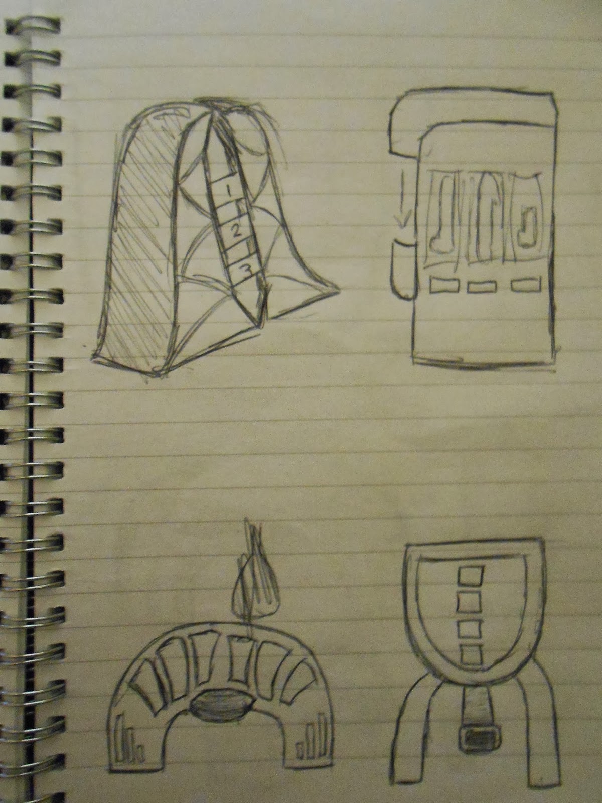
I was set the task of designing, creating, texturing and rendering a vending machine for my Intro to 3D module at University. These are some of my initial design sketches:


I decided on the machine on the lower half of the page above. I went and did small thumbnails of details on the vending machine, a mood board giving a feel of the object and a digital drawing of the machine from the front and side views. 


I then progressed the design further by creating 4 pictures of the machine from different angles, all to scale, a colour perspective drawing and a digital board for it.


Next I am going back to make changes to the design, namely how the bottles dispense, a coin slot, a form of power and to add more textures to the perspective drawing to give it a more real look.